Data presentation
Notes
Summary
Data can be binary, nominal, ordered, discrete quantitative, or continuous quantitative.
Graphs include bar-charts, pie-charts, histograms, box-and-whisker plots and scatter diagrams. The type of graph used should be chosen according to the type of data being displayed. Be aware that graphs may be presented in misleading ways. Furthermore, graphs can be symmetrical, positively skewed or negatively skewed.
Types of average include the mean, median, and mode. Measures of spread include the range, interquartile range, variance, and standard deviation. Means and measures of spread should be chosen according to the type of data being summarised and some measures are susceptible to outliers.
Qualitative data
Qualitative data may be binary, nominal, or ordered.
Qualitative variables have no numerical significance (e.g. we cannot add up or multiply together any values that are assigned to the categories). Qualitative data can be binary, nominal or ordered.
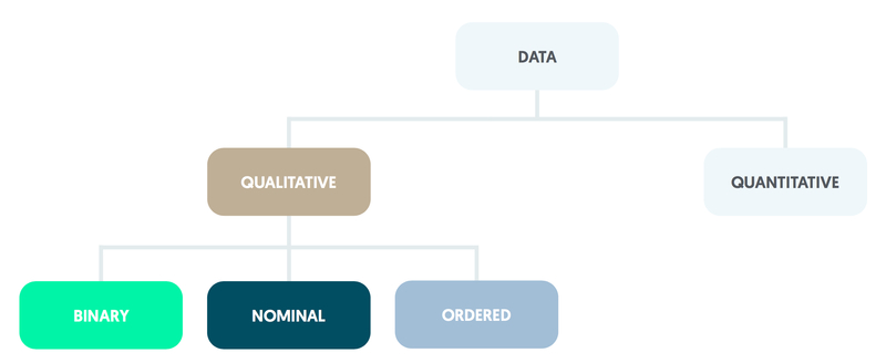
Binary
Binary variables, such as whether or not someone arriving at an A&E department is admitted to a ward, have only two categories.
Nominal
Nominal variables have several categories (e.g. type of scan: CT, MRI, or PET). Any figures attached to the categories (such as CT = 1, MRI = 2, PET = 3) have no numerical meaning.
Ordered
Ordered (or ordinal) variables also have several categories but these can be ranked or ordered using numbers (e.g. health: very poor = 1, poor = 2, intermediate = 3, good = 4, very good = 5).
An individual categorised as having good health is less well than one whose health is rated as very good, but is in better health than someone who has a health rating of intermediate. Note that differences between categories (such as 4 - 3 or 3 – 2 in the example above) do not have a meaningful numerical interpretation.
Quantitative data
Quantitative data can be counted or measured.
Quantitative variables take measured values, which may be further divided into discrete or continuous variables.
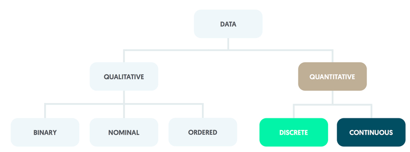
Discrete
Those consisting of whole numbers only are described as discrete quantitative.
An example is the number of visits that a patient makes to an outpatient clinic during a calendar year.
Continuous
Quantitative variables may be continuous and can take values that are constrained only by the accuracy of measurement.
For instance, blood glucose level is usually stated in mmol/L to one decimal place with a normal individual typically having a value of approximately 5.5. Differences between quantitative values are numerically meaningful; two patients differ between themselves by precisely one outpatient visit per year whether their values are 2 and 1 or 12 and 11 (say).
Summarising data using graphs
Graphs display data and should be chosen according to the type of data being presented.
Commonly used graphs include bar- and pie-charts, histograms, box-and-whisker plots and scatter diagrams. Graphs can be symmetrical, positively skewed or negatively skewed. Be aware that graphs may be presented in misleading ways.
Bar-chart
A bar-chart can be used for nominal data, ordered data or, if there are only a few categories, whole numbers.
The bars should be spaced apart, with each height being proportional to the category’s percentage out of the total number of observations.
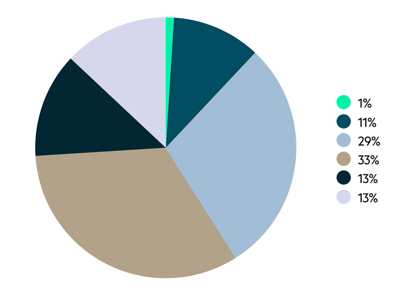
Pie-chart
Pie-charts operate in a similar manner but use sectors within a circle; the angle of each sector is proportional to the category’s percentage out of the total number of observations.
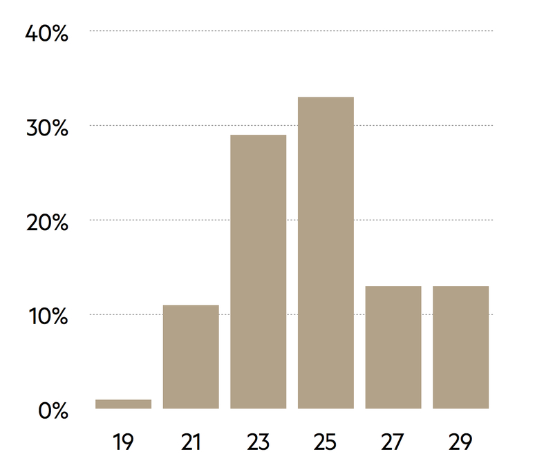
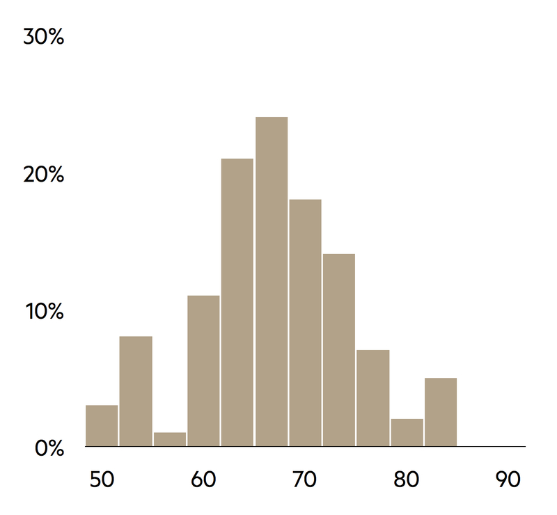
Histogram
With quantitative data, histograms should be used rather than bar-charts. Bars should not have gaps between them as each represents an interval for the variable under consideration.
The histogram is constructed using the number of observations in each interval. It is good practice to use intervals of equal width, as the height of each bar is then proportional to the category’s percentage out of the total number of observations.
The number of intervals to be used should be considered carefully. Too few intervals may prevent important features of the distribution from being identified, whereas too many lead to a distribution with a jagged rather than a smooth shape.
In practice, the number of intervals that should be used is constrained by the size of the sample; a common guideline is that the number of intervals (x) should be roughly equal to the square root (√) of the sample size (n) (e.g. x = √n). Given that a histogram needs at least five bars to be helpful, it is recommended that there should be a minimum of 30 observations.
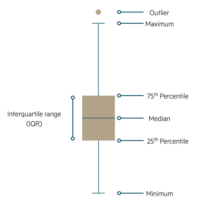
Box-and-whisker plot
An alternative type of graph suitable for continuous quantitative data is the box-and-whisker plot. Values are plotted against the vertical axis.
The main features of a box-and-whisker diagram are based around a line that is parallel to the vertical axis of the graph. Around the centre of the plot there is a rectangle that is divided into two by a horizontal line. This middle line corresponds to the median value of the variable, with the upper and lower horizontal sides of the rectangle representing the upper and lower quartiles of the distribution respectively (these three quantities are defined below).
Vertical whiskers extend from the horizontal edges of the rectangle in both directions; these represent the range of other non-extreme values. Any extreme values, known as outliers, are shown as small circles beyond the limits of the whiskers. Unfortunately, there is no convention as to what constitutes an outlier so a subjective decision may be required.
Comparing groups
The methods described above can be extended to contrast two or more groups within a sample. For example, the size of mechanical valves implanted in heart surgery can be compared for male and female patients by constructing two bar-charts.
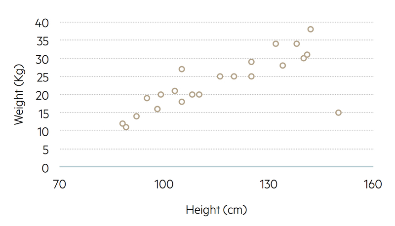
If two continuous variables are being compared, such as height and weight, a scatter diagram can be drawn using a two-dimensional plot.
Scatter diagram
During child development, weight becomes greater with increasing height. Weight is therefore referred to as the outcome variable, with height being the explanatory variable. In a scatter diagram, the outcome variable (weight) is on the vertical axis and the explanatory variable (height) is on the horizontal axis.
Each member of the sample (each child in a group of young people) can be marked on the scatter diagram with a plotted symbol located using that individual’s height and weight values.
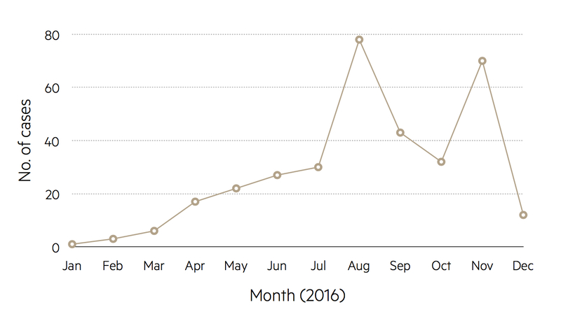
Line plots
Trends over time can be illustrated as line plots. For instance, the number of cases of measles in the UK for consecutive years can be shown as points with the numbers represented by the vertical axis, the base set at zero, and the years indicated along the horizontal axis. Adjacent points are joined together by straight lines to highlight trends.
Graphs presented in misleading ways
It is common to encounter graphs that have been drawn in misleading ways.
For instance, in a graph of trends over time the base of the vertical axis may correspond to a non-zero number in order to give a magnified impression of the size of any changes.
Avoid plotting mean values of groups as bar-charts; this is inappropriate as these charts have been designed for percentages and numbers of observations. In the medical literature, a handle is often attached to the top of each bar in order to give an indication of the variation of the observations within each group, although the way in which the variation has been measured is often not explained.
Using a ploy similar to the non-zero origin that can be found in time trend graphs, bar-charts may be presented with a broken vertical axis. This effectively removes a middle section of the axis in order to inflate differences between the bar heights.
In the media, pie-charts are often given a three-dimensional representation, which is thought to be more eye catching than the traditional circle. However, this method of presentation can create an optical illusion whereby the sectors in the lower region of the resulting ellipse appear magnified and those in the upper region appear contracted.
Summarising data numerically
It is important not only to illustrate data graphically but also to summarise the main features using straightforward arithmetic.
Average
An impression of the size of a typical value from a distribution may be found by calculating an average. There are three main types:
- Mean
- Median
- Mode
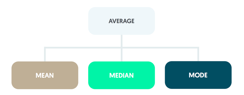
Mean
The mean is obtained by summing the values. This total is then divided by the size of the sample.
Median
The median is the middle observation when the values are ordered in terms of size. If the number of observations is even, the mean of the middle pair is calculated.
Mode
The mode is found from a frequency count of the values recorded and is the most common value.
Variability
The variability of the observations is summarised using a measure of spread. Methods include the range, the interquartile range, the variance, and the standard deviation.
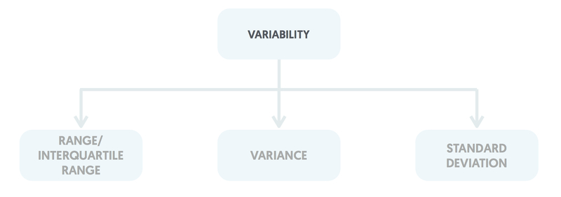
Range & interquartile range
The range is the difference between the largest and smallest values. The interquartile range is the difference between the upper and lower quartiles, where the upper quartile is the value midway between the median and the largest value and the lower quartile is midway between the smallest value and the median.
Variance
The variance is found by subtracting the mean from each observation, squaring each of these differences, summing them, and dividing the total by the sample size minus one.
Standard deviation
The standard deviation is calculated as the square root of the variance. Standard deviations are generally preferred to variances as they are in the same units as those of the original observations (for instance, if systolic blood pressure is measured in mm Hg, the standard deviation values will be in mm Hg).
Outliers
Outliers can have a considerable impact on some types of average and measures of spread.
The mean can be inflated by a single extremely large value, along with the variance and standard deviation. The median and interquartile range are only influenced by outliers if they form a substantial fraction of the whole sample.
By definition, the range is highly susceptible to outliers and it tends to increase as the sample size becomes larger.
Distribution
The shape of distribution should be checked in terms of the values away from the central region (or the tails of the distribution).
For this introductory discussion it is assumed that the distribution has only one peak. Variables can be symmetrical (as with adult weight in some populations), positively skewed having a few extremely high values and a long tail pointing in the positive direction (e.g. adult alcohol consumption) or negatively skewed by a few extremely low values with a long tail pointing in the negative direction (e.g. length of gestation for live births).
There is an important relationship between the mean, median and the presence or absence of symmetry. For symmetrical distributions the mean and the median are equal. Positively skewed distributions have a mean greater than the median, and negatively skewed distributions have a median greater than the mean.
Other distributions that are encountered include those with more than one peak (e.g. the blood glucose measurements in mmol/L for a mixed group of normal and diabetic individuals) and U-shaped distributions for which observations are less likely to occur in the central portion of the distribution than towards the edges.
Last updated: January 2023
Have comments about these notes? Leave us feedback